TikTok · Trust & SafetyRestructuring the mobile support experience
Content design for TikTok's customer service journey on mobile, from the moment a user goes looking for help to the survey that closes the loop. Every step is someone with a problem, and every word either shortens their path or lengthens it.
RoleContent Designer
Content Strategist
ScopeEntry point
Chatbot
Support tickets
Customer satisfaction score (CSAT)
SurfaceTikTok mobile app
ImpactIncreased survey completion & CSAT scores
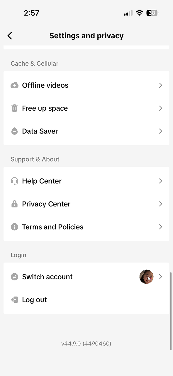
Positioning Customer Service as Help Center
The challenge
Nobody browses a Help Center for fun
Every user in this flow arrived with a problem. Something broke, an account got locked, a video won't post. The old experience made them work for help: unclear entry points, dead-end FAQ pages, and no sense of where their ticket stood once they filed it.
I helped restructure the customer service entry point on mobile so the path from "something's wrong" to "it's handled" is as short as the words can make it, with a feedback loop at the end that tells the team how it went.
The journey
Phase 1: Finding help
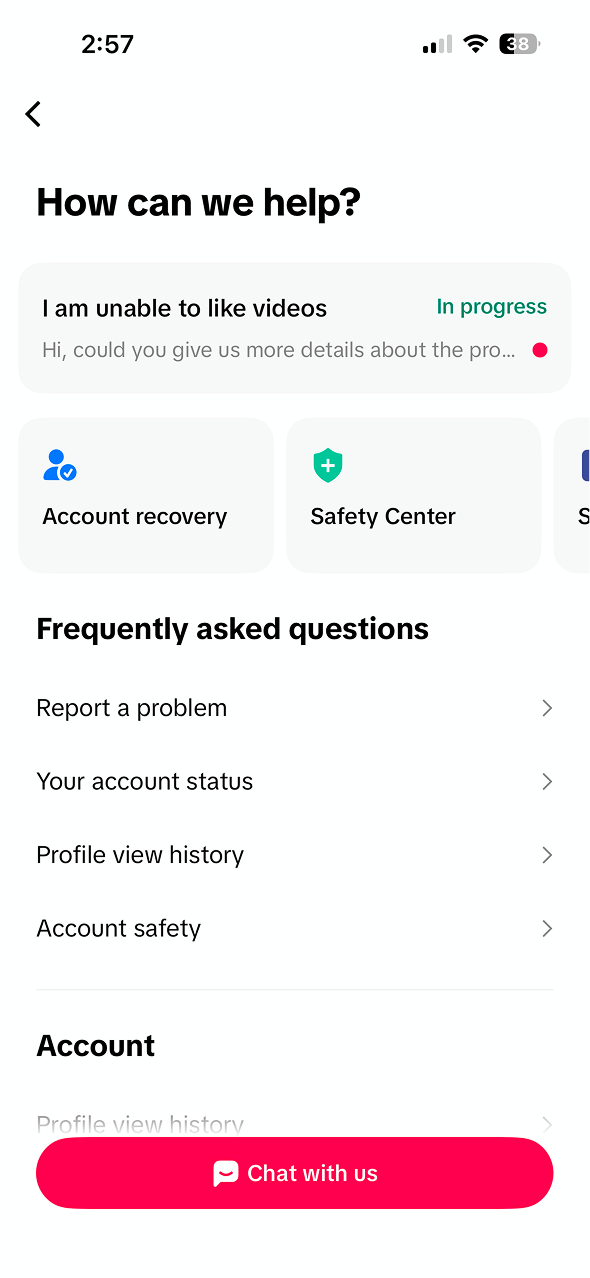
Help hub shows open ticket status, quick links, and frequently asked questions
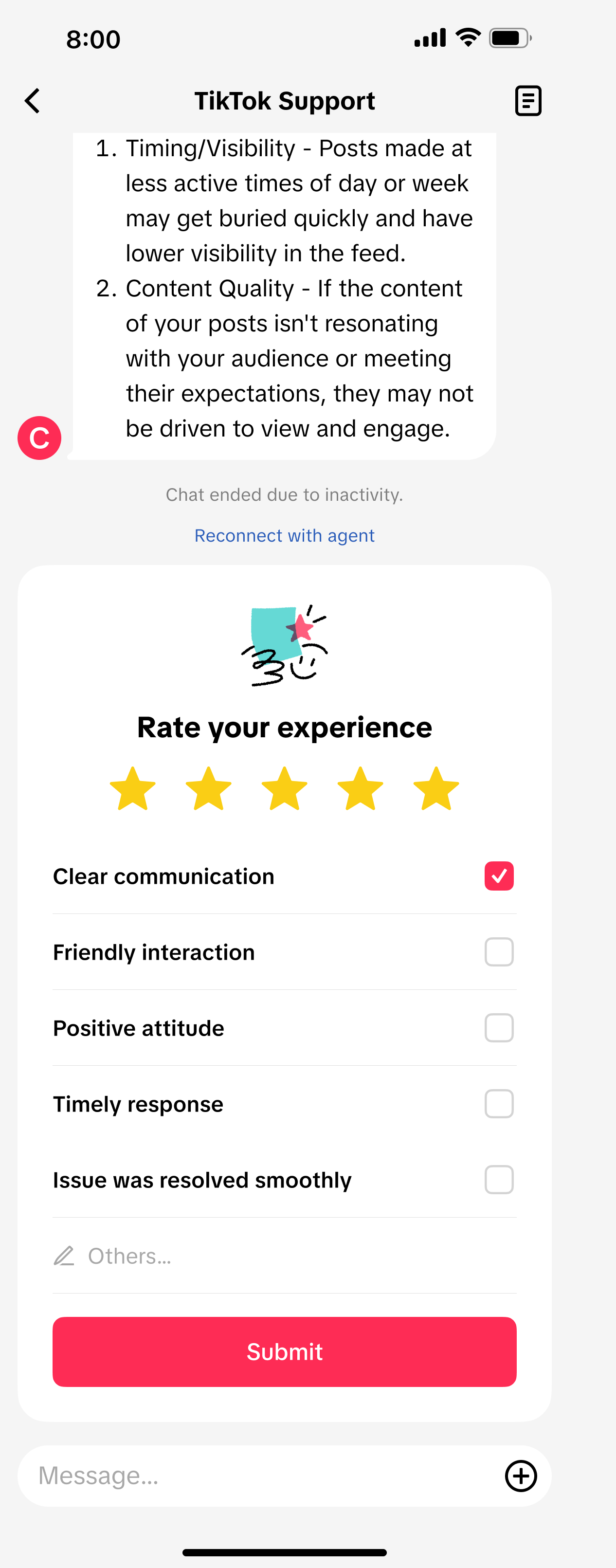
Positive framing, affirming the agent: "Clear communication," "Friendly interaction," "Issue was resolved smoothly."
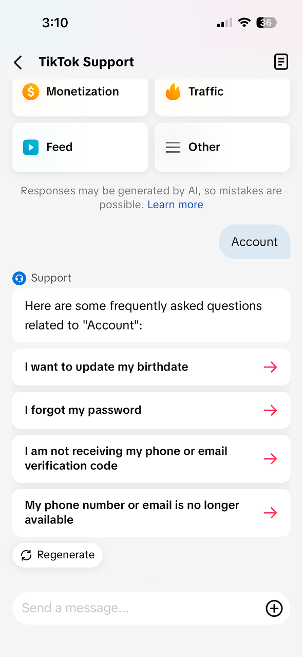
Support chatbot showing category chips and suggested FAQ questions written in first person
Phase 2: The ticket
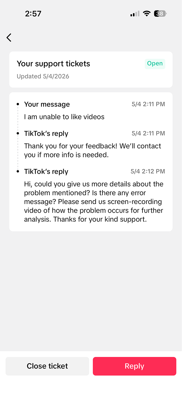
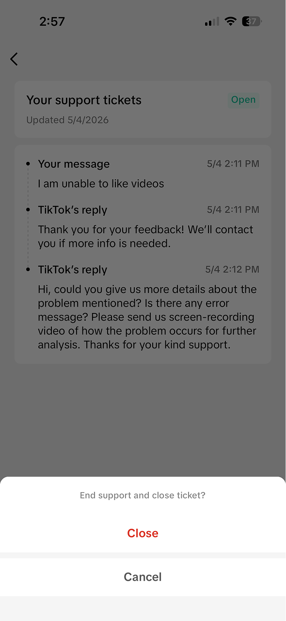
Tickets read as a timestamped conversation with a visible status badge. The user always knows what was said and whose move it is. Closing takes one plain confirmation ("End support and close ticket?") with Cancel right there. No guilt trip, no "are you sure?"
Phase 3: Closing the loop
One survey, two conversations
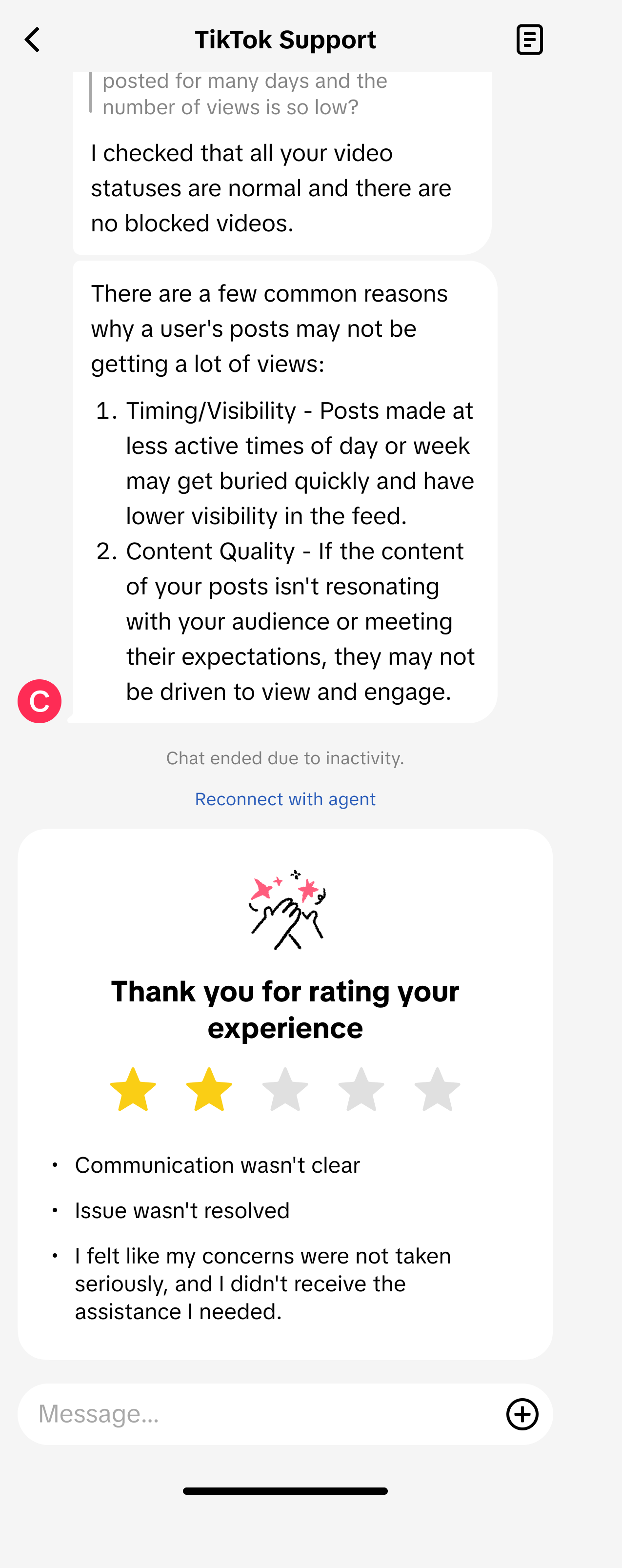
The reason options adapt to the rating. Tap 4 or 5 stars and the survey asks what went well. Tap 1 to 3 and it asks what went wrong, in language that validates the frustration instead of ignoring it.
4-5 stars: what went well
1-3 stars: what went wrong
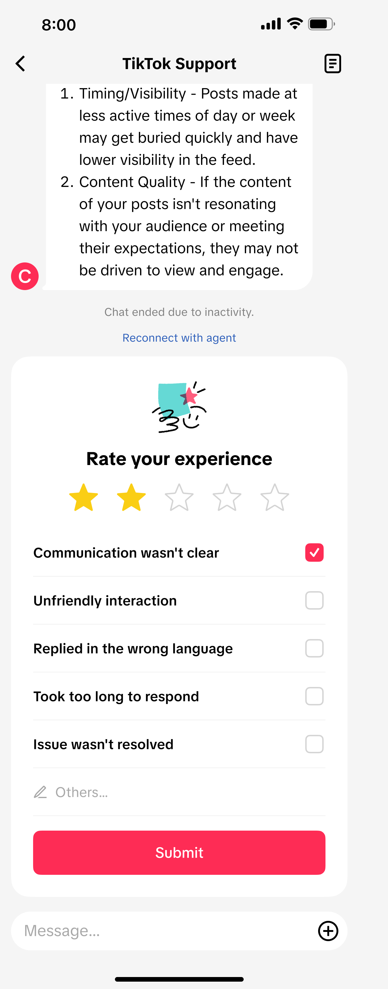
The same categories, mirrored into problems: "Communication wasn't clear," "Took too long to respond," "Issue wasn't resolved."
"Clear communication" ↔ "Communication wasn't clear"
Mirrored options mean comparable data on both sides of the rating.
The thank-you state
After submission, the survey echoes back the rating and reasons the user selected. Their feedback stays visible instead of vanishing into a void: we received this, exactly as you said it.
Process
What changed and why
The work spanned how help is found (entry point, hub hierarchy, chatbot questions) and how it closes (the ticket experience and the survey, which I rewrote end to end). The reason options took the most iteration: each had to be short enough to scan, specific enough to be actionable for the support team, and neutral enough that selecting one felt like reporting, not complaining.
Impact
What it changed
Survey completion rates went up. User confusion went down. More finished surveys meant more sentiment data for the support team, which is the entire point: you can't improve an experience you can't hear about.
Help lives under a plainly labeled entry in Settings, and the hub opens with a question instead of a menu. Open tickets appear first with live status, so returning users never hunt for their own issue. In the chatbot, suggested questions are phrased in first person ("I forgot my password") so users recognize their problem instead of translating it into support-speak.